
Medical Expenses Prediction

For a health insurance provider to remain financially viable, it must collect more in annual premiums than it pays out in medical claims. To achieve this balance, insurers heavily rely on predictive modeling—investing significant resources into developing accurate forecasts of healthcare costs for their members.
By analyzing historical data, demographic trends, and medical risk factors, insurers can estimate future expenses and set premium rates accordingly. These models help companies mitigate financial risk while ensuring competitive pricing in the marketplace.
Accurately forecasting medical expenditures presents significant difficulties due to the unpredictable nature of high-cost medical events. The most expensive health conditions tend to occur infrequently and often appear statistically random in populations. However, epidemiological patterns reveal that certain demographic groups face elevated risks for specific conditions. For instance, tobacco users (smokers) demonstrate substantially higher rates of lung cancer incidence than non-smokers, elderly populations typically reuire more frequent medical intervention, and individuals with obesity show increased susceptibility to cardiovascular diseases.
In this project, you will use patient data to forecast the average medical care expenses for such population segments. These estimates could be used to create actuarial tables that set the price of yearly premiums higher or lower according to the expected treatment costs. .
1.1 Data Description
The dataset used for this analysis, is retrieved from publicly available insurance dataset obtained from the Kaggle, containing hypothetical medical expenses for patients in the United States. Each row in this file corresponds to one unique insurer or beneficiaries currently enrolled in the insurance plan, and each column are features indicating characteristics of the patient as well as the total medical expenses charged to the plan for the year, as explained below::
1
2
3
4
5
6
7
age: An integer indicating the age of the primary beneficiary (excluding those above 64 years, as they are generally covered by the government)
sex: The policy holder's gender: either male or female
bmi: The body mass index (BMI), which provides a sense of how over or underweight a person is relative to their height. BMI is equal to weight (in kilograms) divided by height (in meters) squared. An ideal BMI is within the range of 8.5 to 24.9.
children: An integer indicating the number of children/dependants covered by the insurance plan.
smoker: A yes or no categorical variable that indicates whether the insured regularly smokes tobacco
region: The beneficiary's place of residence in the US, divided into four geographic regions: northeast, southeast, southwest, or northwest.
The dataset is available here 👉 kaggle in CSV format. Here is a link to all the code for this project on my blog desksql.
First, let’s import the modules and datasets needed for this tutorials.
1.2. Import Libraries
Import all the necessary python Libraries or Packages necessary to build the project, after setting-up your environment.
import pandas as pd
import numpy as np
import matplotlib.pyplot as plt
import seaborn as sns

from plotly.offline import init_notebook_mode
init_notebook_mode(connected=True)
from plotly.subplots import make_subplots
import plotly.graph_objects as go

import warnings
warnings.filterwarnings('ignore')  # Corrected function name and parameter

%matplotlib inline

# View all columns in dataframe
pd.set_option('display.max_columns', None)
1.3. Load the data
Let’s read in the insuarance dataset stored in your current directory into pandas DataFrame (df) using .read_csv().
# load in the insurance data
insurance_data = pd.read_csv('./data/insurance.csv')
Let’s display the dimension of the data (rows and column) by using shape characteristic of the data object - df.
# Determine the shape of the dataset
print("Insurance data shape", insurance_data.shape)
The insurance.csv file includes 1,338 samples of beneficiaries currently enrolled in the insurance plan, with features indicating characteristics of the patient as well as the total medical expenses charged to the plan for the year.
Let’s observe the data by calling .head(). The .head()` function by default shows us the first five rows and as many coluns as it can fit within the notebook.
# Display dataframe and view all columns
insurance_data.head()

# Get summary statistics for all columns
insurance_data.describe(include = 'all').T

2. Exploring and Preparing the data
Let’s take a look at the data in more to build a foundation for our analysis. This step typically involves the following steps:
1
2
3
4
5
Checking for null enteries and outlier detection
Exploratory Data Analysis
Identifying covariance
Feature Engineering.
Let's proceed in order
2.1. Missing Values
Before proceeding with any data analysis, it’s always a good idea to pay attention to missing values - how many of them there are, where they occur, et, cetera. Let’s print out the features with null values.
# View null values
insurance_data.isnull().any()
1
2
3
4
5
6
7
8
9
age         False
sex         False
bmi         False
children    False
smoker      False
region      False
charges     False
dtype: bool
The any() function is useful to detect missing data, but it doesn’t really show us how many values are missing for each columns. To probe into this issue in more detail, we need to use sum() instead.
# Check for null values
insurance_data.isnull().sum()
age         0
sex         0
bmi         0
children    0
smoker      0
region      0
charges     0
dtype: int64
Let’s probe with missingno visualization.
import missingno as msno
%matplotlib inline
%config InlineBackend.figure_format = 'png'

msno.matrix(insurance_data)
plt.show()
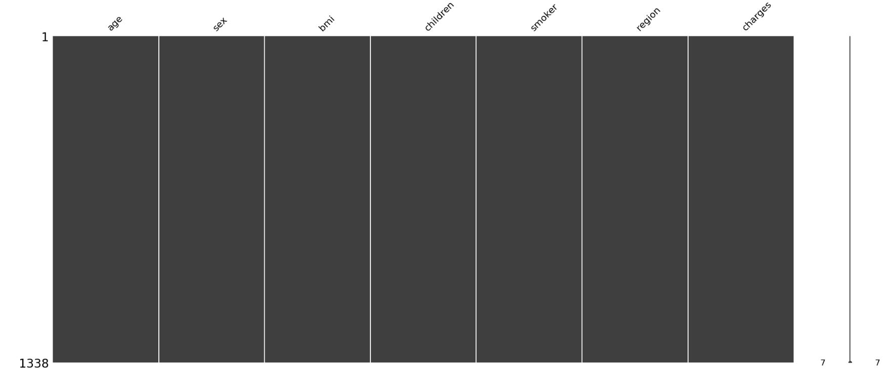
This visualization gives us a more intuitive sense of where the values are missing. In our case, there are no missing data identified. Let’s proceed to exploring the features.
2.2. Checking Duplicate Values
def get_duplicate_rows(df):
    """
    Returns the actual duplicate rows as a DataFrame (excluding the first occurrence).
    """
    return df[df.duplicated()]

get_duplicate_rows(insurance_data)

Only one duplicate row. Let’s drop it
# Drop duplicate row
insurance_data = insurance_data.drop_duplicates()
2.3. Outlier detection
def detect_outliers_iqr(data, col, threshold = 1.5):
    """Detect outliers using IQR method."""
    q1 = data[col].quantile(0.25)
    q3 = data[col].quantile(0.75)
    iqr = q3 - q1
    lower_bound = q1 - threshold * iqr
    upper_bound = q3 + threshold * iqr
    return (data[col] < lower_bound) | (data[col] > upper_bound)

# Example usage with numerical columns
colnames_numerical = ['age', 'children', 'charges', 'bmi']  # Your numerical columns here

# Calculate outliers with different thresholds
iqr1 = insurance_data[colnames_numerical].apply(lambda x: detect_outliers_iqr(insurance_data, x.name, 1.5))
iqr2 = insurance_data[colnames_numerical].apply(lambda x: detect_outliers_iqr(insurance_data, x.name, 2.0))
iqr3 = insurance_data[colnames_numerical].apply(lambda x: detect_outliers_iqr(insurance_data, x.name, 3.0))

# Outlier plot
f, (ax1, ax2, ax3) = plt.subplots(ncols = 3, figsize = (16,5))
sns.heatmap(iqr1, cmap = ['white', 'red'], ax = ax1, cbar = False)
sns.heatmap(iqr2, cmap = ['white', 'red'], ax = ax2, cbar = False)
sns.heatmap(iqr3, cmap = ['white', 'red'], ax = ax3, cbar = False)

ax1.set_title('Outliers (IQR threshold = 1.5)')
ax2.set_title('Outliers (IQR threshold = 2.0)')
ax3.set_title('Outliers (IQR threshold = 3.0)')

for ax in [ax1, ax2, ax3]:
    ax.set_xticklabels(ax.get_xticklabels(), rotation = 90, ha = 'right')

plt.tight_layout()
plt.show()

# Print outlier counts
print("Outlier counts:")
print(f"Threshold 1.5: {iqr1.sum().sum()} total outliers")
print(f"Threshold 2.0: {iqr2.sum().sum()} total outliers")
print(f"Threshold 3.0: {iqr3.sum().sum()} total outliers")
Output:
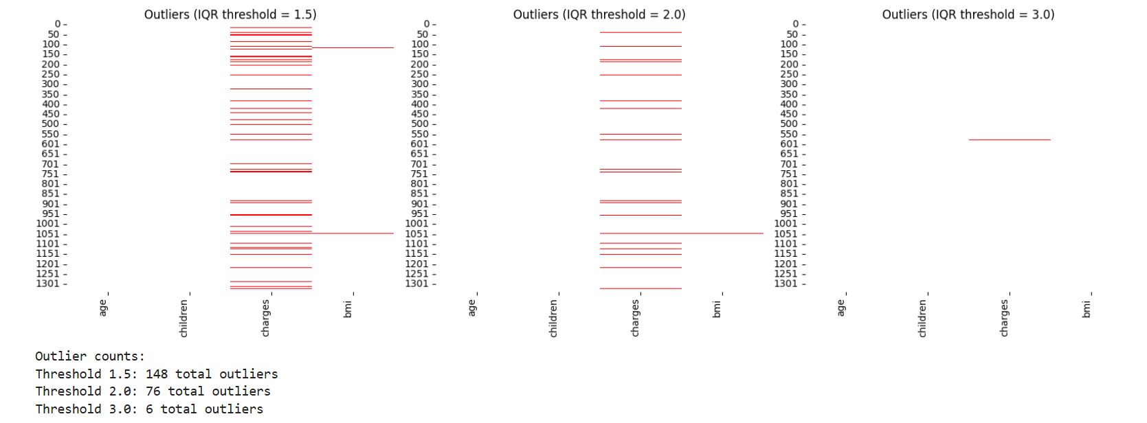
There are fewer rows with outliers that are more than 3.0 IQR which we will clean later from the dataset.
# ---------------------------------------
 # Removing Outliers
# ---------------------------------------
def remove_outliers_iqr(df, columns = None, threshold = 1.5):
    """
    Remove outliers from specified columns using IQR method.

    Parameters:
    df (DataFrame): Input dataframe
    columns (list): List of columns to process (defaults to all numeric columns)
    threshold (float): IQR multiplier threshold (default 1.5)

    Returns:
    DataFrame: Data with outliers removed
    """
    if columns is None:
        columns = df.select_dtypes(include=[np.number]).columns.tolist()

    # Create a mask of non-outliers
    mask = pd.Series(True, index=df.index)

    for col in columns:
        if col in df.columns:
            q1 = df[col].quantile(0.25)
            q3 = df[col].quantile(0.75)
            iqr = q3 - q1
            lower_bound = q1 - threshold * iqr
            upper_bound = q3 + threshold * iqr
            col_mask = (df[col] >= lower_bound) & (df[col] <= upper_bound)
            mask &= col_mask

    # Calculate percentage of data being removed
    pct_removed = 100 * (len(df) - mask.sum()) / len(df)
    print(f"Removed {len(df) - mask.sum()} outliers ({pct_removed:.2f}% of data)")

    return df[mask]
# Remove outliers from all numeric columns with threshold 2.7
cleaned_insurance_data =  remove_outliers_iqr(insurance_data, columns = ['charges'], threshold = 2.7)
Removed 11 outliers (0.82% of data)
2.4 Exploratory Data Analysis
In order to understand which models have predictive power, and to build a common sense understanding of what is driving medical expenses to understand results, it is essiential to explore the data and observe how features interact with the target variable.
Broadly, thre are two types of data.
1
2
Continous data (e.g., age, bmi)
Categorical data (e.g., sex, region)
Now, let’s visualize the Continuous data.
Call the information or info() function to explore each column in the dataset, and confirm that the data is formatted as we had expected and that we have the correct data type for each column.
# Display dataframe information
cleaned_insurance_data.info()
Output:
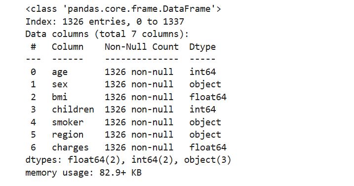
It looks like all the columns are encode in the right format, which are a combination of float and integer data types. Our model’s dependent variable is charges, which measures the medical costs each person charged to the insurance plan for the year.
Prior to building a model, it is often useful to check for normality of the target feature (Charges). The model fits better when the data is normally distributed, meaning that the mean serves as a reliable measure of central tendency. In such cases, many statistical and machine learning models, especially those assuming linearity or relying on parametric assumptions, perform more accurately and produce more generalizable results. Let’s look at the summary statistics.
# Get summary statistics for charges column
cleaned_insurance_data['charges'].describe()
Output:
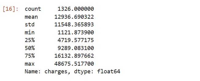
insight:
The mean value is greater than the median, it implies that the distribution of insurance expenses is right-skewed. We can confirm this visually using a histogram:
Note that, histogram us a snapshot in time of the variation in the data. It measures how often a value or range of values occurred in the data.
# plot the distribution (charges feature)
plt.figure(figsize = (12, 4))

# Histogram with KDE
plt.subplot(1, 2, 1)
sns.histplot(cleaned_insurance_data['charges'], kde = True, bins = 30, color = '#3498db', edgecolor = 'white')
plt.title('Distribution of Charges', fontsize = 12, pad = 14)
plt.xlabel('Charges ($)', fontsize = 12)
plt.ylabel('Frequency', fontsize = 12)
plt.grid(axis = 'y', alpha = 0.3)

# Add vertical lines for key statistics
stats = cleaned_insurance_data['charges'].describe()
plt.axvline(stats['25%'], color = '#e74c3c', linestyle = ':', linewidth = 2)
plt.axvline(stats['50%'], color = '#e74c3c', linestyle = '--', linewidth = 2)
plt.axvline(stats['75%'], color = '#e74c3c', linestyle = ':', linewidth = 2)

# Boxplot
plt.subplot(1, 2, 2)
sns.boxplot(x = cleaned_insurance_data['charges'], color = '#2ecc71', width = 0.4)
plt.title('Spread of Charges', fontsize = 12, pad = 14)
plt.xlabel('Charges ($)', fontsize = 12)
plt.grid(axis = 'y', alpha = 0.3)

plt.tight_layout()
plt.show()

# Print summary statistics
print("Key Statistics:")
print(f"- Range: {stats['min']:,.2f} to {stats['max']:,.2f}")
print(f"- Mean: {stats['mean']:,.2f} (SD: {stats['std']:,.2f})")
print(f"- Median (50th %ile): {stats['50%']:,.2f}")
print(f"- IQR (25th-75th %ile): {stats['25%']:,.2f} to {stats['75%']:,.2f}")
output :
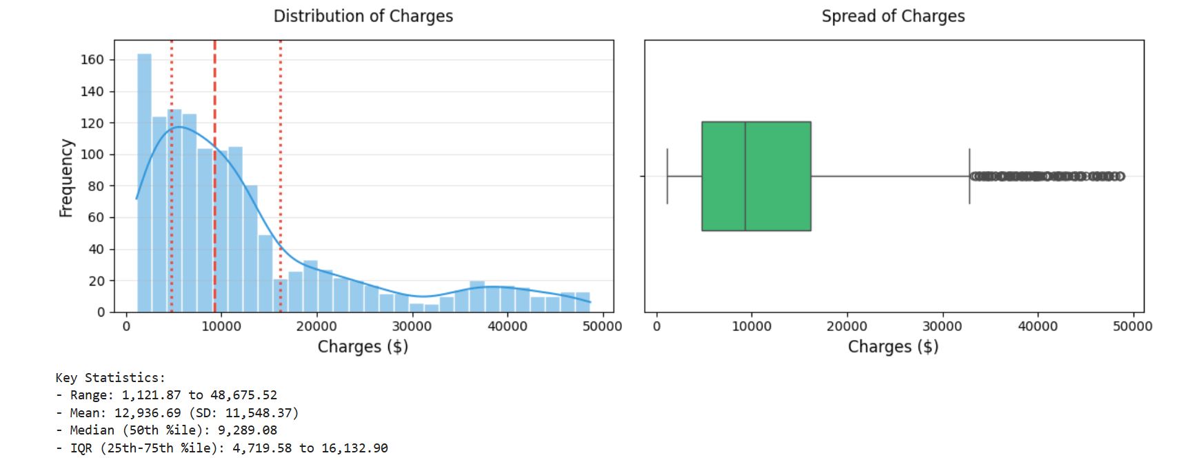
insight:
1
2
As expected, the figure shows a right-skewed distribution. It also shows that the majority of clients in our data have yearly medical expenses between zero and 15000USD with few claims at the high end of the distribution.
The distribution is not ideal for linear regression, and knowing this weakness would help us design a better-fitting model later on.
# check the nature of skewedness
from scipy import stats

skewness = stats.skew(cleaned_insurance_data['charges'])
print(f"Skewness: {skewness:.2f}")
Skewness: 1.45 A value > 1 indicates right-skewed distribution.
Age
# Get summary statistics for age feature
cleaned_insurance_data['age'].describe()
output :
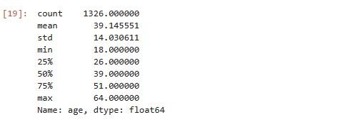
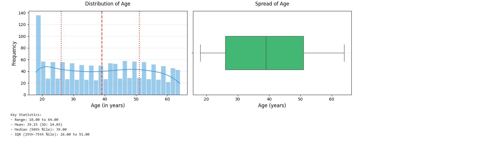
Mean age of clients is 39 years, and the oldest person is 64 years. Age distribution looks uniform, a bit right-skewed. We can confirm this visually using a histogram:
# plot distribution of age feature
## Histogram with KDE
plt.figure(figsize=(12, 4))
plt.subplot(1, 2, 1)
sns.histplot(cleaned_insurance_data['age'], kde = True, bins = 30, color = '#3498db', edgecolor = 'white')
plt.title('Distribution of Age', fontsize = 12, pad = 14)
plt.xlabel('Age (in years)', fontsize = 12)
plt.ylabel('Frequency', fontsize = 12)
plt.grid(axis = 'y', alpha = 0.3)

# Add vertical lines for key statistics
stats = cleaned_insurance_data['age'].describe()
plt.axvline(stats['25%'], color = '#e74c3c', linestyle = ':', linewidth = 2)
plt.axvline(stats['50%'], color = '#e74c3c', linestyle = '--', linewidth = 2)
plt.axvline(stats['75%'], color = '#e74c3c', linestyle = ':', linewidth = 2)

## Boxplot
plt.subplot(1, 2, 2)
sns.boxplot(x = cleaned_insurance_data['age'], color = '#2ecc71', width = 0.4)
plt.title('Spread of Age', fontsize = 12, pad = 14)
plt.xlabel('Age (years)', fontsize = 12)
plt.grid(axis = 'y', alpha = 0.3)

plt.tight_layout()
plt.show()

# Print summary statistics
print("Key Statistics:")
print(f"- Range: {stats['min']:,.2f} to {stats['max']:,.2f}")
print(f"- Mean: {stats['mean']:,.2f} (SD: {stats['std']:,.2f})")
print(f"- Median (50th %ile): {stats['50%']:,.2f}")
print(f"- IQR (25th-75th %ile): {stats['25%']:,.2f} to {stats['75%']:,.2f}")
output :
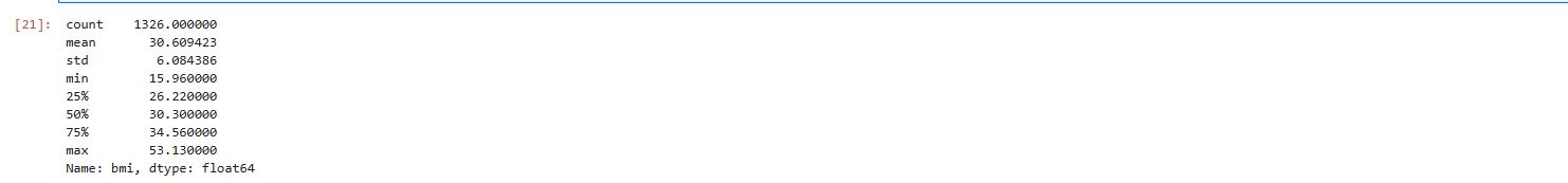
Body Mass Index (BMI)
# Get summary statistics for bmi feature
cleaned_insurance_data.bmi.describe()
output :
# Histogram with KDE
plt.figure(figsize = (12, 4))
plt.subplot(1, 2, 1)
sns.histplot(cleaned_insurance_data['bmi'], kde = True, bins = 30, color = '#3498db', edgecolor = 'white')
plt.title('Distribution of Body Mass Index', fontsize = 12, pad = 14)
plt.xlabel('BMI', fontsize = 12)
plt.ylabel('Frequency', fontsize = 12)
plt.grid(axis = 'y', alpha = 0.3)

# Add vertical lines for key statistics
stats = cleaned_insurance_data['bmi'].describe()
plt.axvline(stats['25%'], color = '#e74c3c', linestyle = ':', linewidth = 2)
plt.axvline(stats['50%'], color = '#e74c3c', linestyle = '--', linewidth = 2)
plt.axvline(stats['75%'], color = '#e74c3c', linestyle = ':', linewidth = 2)

# Boxplot
plt.subplot(1, 2, 2)
sns.boxplot(x = cleaned_insurance_data['bmi'], color = '#2ecc71', width = 0.4)
plt.title('Spread of Body mass index', fontsize = 12, pad = 14)
plt.xlabel('BMI', fontsize = 12)
plt.grid(axis = 'y', alpha = 0.3)

plt.tight_layout()
plt.show()

# Print summary statistics
print("Key Statistics:")
print(f"- Range: {stats['min']:,.2f} to {stats['max']:,.2f}")
print(f"- Mean: {stats['mean']:,.2f} (SD: {stats['std']:,.2f})")
print(f"- Median (50th %ile): {stats['50%']:,.2f}")
print(f"- IQR (25th-75th %ile): {stats['25%']:,.2f} to {stats['75%']:,.2f}")
output :
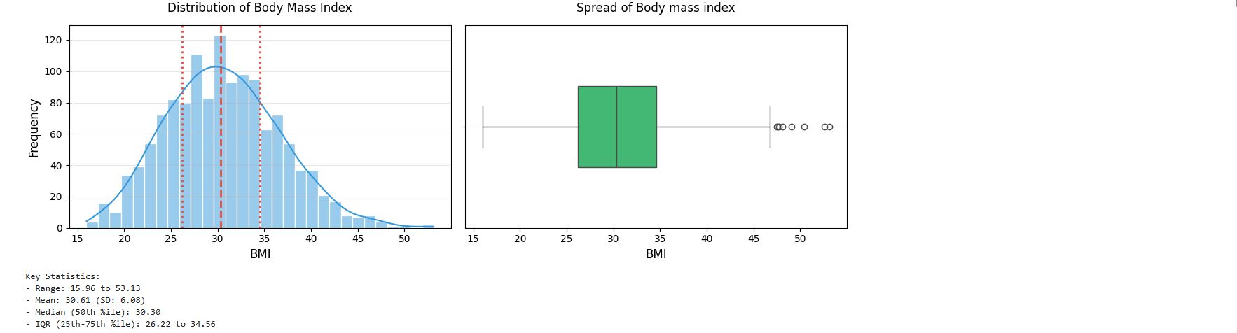
insight: The body mass index data seems to follow the normal distribution. It is reasonable to assume that these data come from a normal distribution.
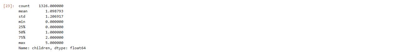
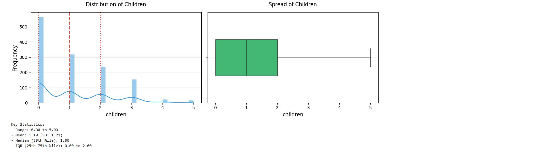
Children
# Get summary statistics for children feature
cleaned_insurance_data.children.describe()
output :
# Histogram with KDE
plt.figure(figsize = (12, 4))
plt.subplot(1, 2, 1)
sns.histplot(cleaned_insurance_data['children'], kde = True, bins = 30, color = '#3498db', edgecolor = 'white')
plt.title('Distribution of Children', fontsize = 12, pad = 14)
plt.xlabel('children', fontsize = 12)
plt.ylabel('Frequency', fontsize = 12)
plt.grid(axis = 'y', alpha = 0.3)

# Add vertical lines for key statistics
stats = cleaned_insurance_data['children'].describe()
plt.axvline(stats['25%'], color = '#e74c3c', linestyle = ':', linewidth = 2)
plt.axvline(stats['50%'], color = '#e74c3c', linestyle = '--', linewidth = 2)
plt.axvline(stats['75%'], color = '#e74c3c', linestyle = ':', linewidth = 2)

# Boxplot
plt.subplot(1, 2, 2)
sns.boxplot(x = cleaned_insurance_data['children'], color = '#2ecc71', width = 0.4)
plt.title('Spread of Children', fontsize = 12, pad = 14)
plt.xlabel('children', fontsize = 12)
plt.grid(axis = 'y', alpha = 0.3)

plt.tight_layout()
plt.show()

# Print summary statistics
print("Key Statistics:")
print(f"- Range: {stats['min']:,.2f} to {stats['max']:,.2f}")
print(f"- Mean: {stats['mean']:,.2f} (SD: {stats['std']:,.2f})")
print(f"- Median (50th %ile): {stats['50%']:,.2f}")
print(f"- IQR (25th-75th %ile): {stats['25%']:,.2f} to {stats['75%']:,.2f}")
output :
Region
## Get frequency distribution for region feature
display(pd.crosstab(index = cleaned_insurance_data['region'], columns = '% observations', normalize = 'columns').T)
output :
 From the summary output, we see that our clients are evenly spread in among four geographic regions. We’ll take a closer look to see how they are distributed
import plotly.express as px

px.histogram (cleaned_insurance_data, x = 'region', color_discrete_sequence = px.colors.qualitative.Vivid, title = 'region counts', template = 'plotly_white')
 Never miss a story subscribe to my newsletter